Helen Lucas Architects
Approachable architects who take every detail seriously
A meeting of minds led to a new visual identity and website for this highly regarded Edinburgh practice.
In 2013 we strengthened Helen Lucas Architects’ messaging through understated and precise detailing—from use of colour to the wording of website navigation.

Director, Helen Lucas Architects

Digital Graphic design
Less a professional portfolio website, more a magazine.
We approached the website with magazines in mind. Many of the practice’s clients have never before commissioned an architect: the website needed to replicate the welcoming and professional atmosphere of the HLA studio in a format that spoke to its main audience.
Utilising existing assets
Making the most of photography.
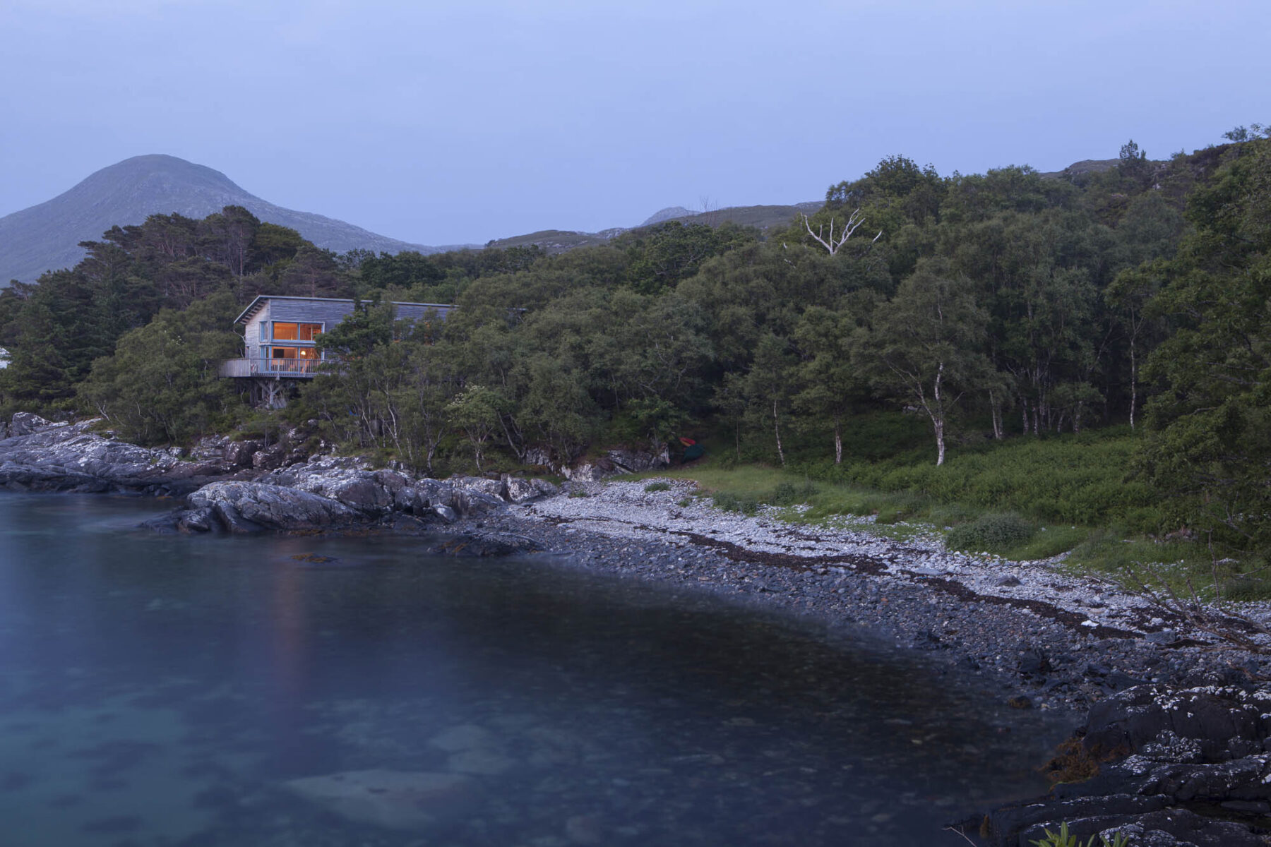
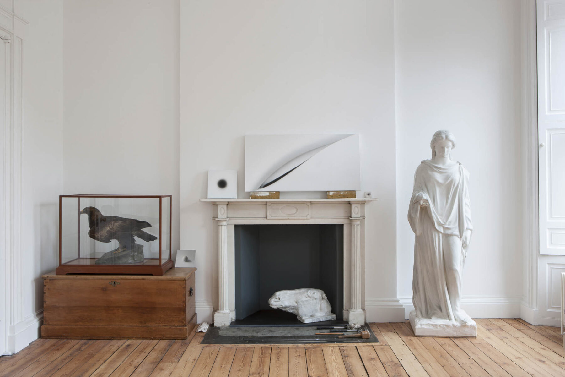
Helen Lucas Architects had always taken the documentation of projects seriously. The new website was built to make the most of this important asset.
In addition to providing beautiful and detailed illustration of projects, photography gives a means of visual navigation.

Communicating through Digital design
Colour and information architecture work together to give a sense of how this practice works.
The website is softened by use of yellow ochre and a controlled palette.
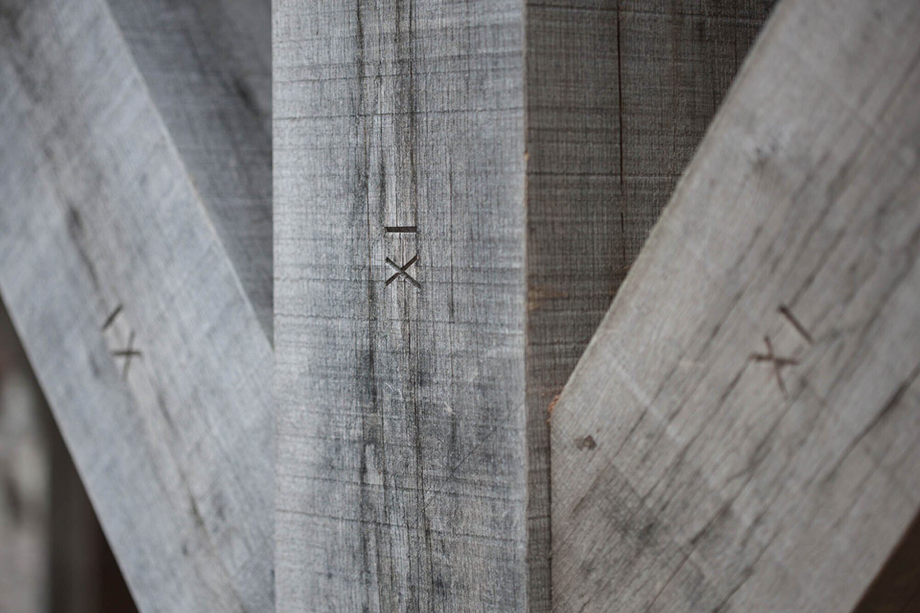
Site visitors are introduced to the work of the firm in various ways. The dedicated area for materials and detailing is an example of the gentle, explanatory content strategy. Useful to those who are not construction professionals, to fellow-architects this is also a marker of how seriously the practice takes detailing.


Director, Helen Lucas Architects
Logo design
In addition to elegant typography, the logo is given interest with a linear boundary.
Space is created within the logo. The logotype is not centred: it is contained but not hemmed in. It makes its own space.
The logo itself displays well at a small size (important on drawings and other professional stationery).


Visual identity
Extending from the logo for coherent detailing.
A small, linear motif is used as an icon and the boundary line travels through the website, stationery and signage—and across exterior paintwork at the HLA studios.

Stationery
Consistent design can be light-touch.
In the right place playfulness can be injected into a professional visual identity; Christmas cards have become a considered piece of print design.

The result
Since launching in 2013, the identity and website have proven to be enormously successful.
The website has brought countless high-quality enquiries and continues to attract well-qualified prospective staff.
We are often approached by prospective clients who would like ‘something simple, like the Helen Lucas website’. This is such a compliment. To those who use it, a website containing complexity and detail feels remarkably straightforward.


