Harry Taylor & Company
The first brand design for a firm established in 1960
With a team comprising surveyors and architects, this busy Perth firm works on prestigious projects across Scotland.
The visual identity and website are designed to correctly position the brand and engage a range of audiences including private clients, fellow professionals and prospective team members.


BranD and positioning
Known as a safe pair of hands, Harry Taylor & Co has particular experience with historic and listed buildings.
We designed branding to reflect its professional, yet unstuffy, approach to construction projects and the conservation of Scotland’s built heritage.

Art direction
Portrait and documentary photography became an important, scene-setting brand element.
We art directed a shoot on location with photographer Angus Bremner. By taking time to put everyone at ease, we got some great images of this practical and friendly team at work.


Logo design
Varied routes led us to the style of logo that felt most comfortable to the client.
Settling on Quadraat, a serif typeface with an interesting display font, we then paired the logotype with a mark inspired by classical detailing in the firm’s archive of drawings. Two versions of the logo fit different contexts.


Visual identity
Plan drawings became a key reference point for the whole identity.
While leafing through architectural drawings at the Harry Taylor & Co offices, we immediately spotted a lead for the look and feel of brand elements.
The influence of architectural drawing convention can be seen throughout the identity. Fine line and crisp, monochrome detailing run through all stationery and printed collateral—and continues into the website.

Website design and build
The website takes a content-first approach.
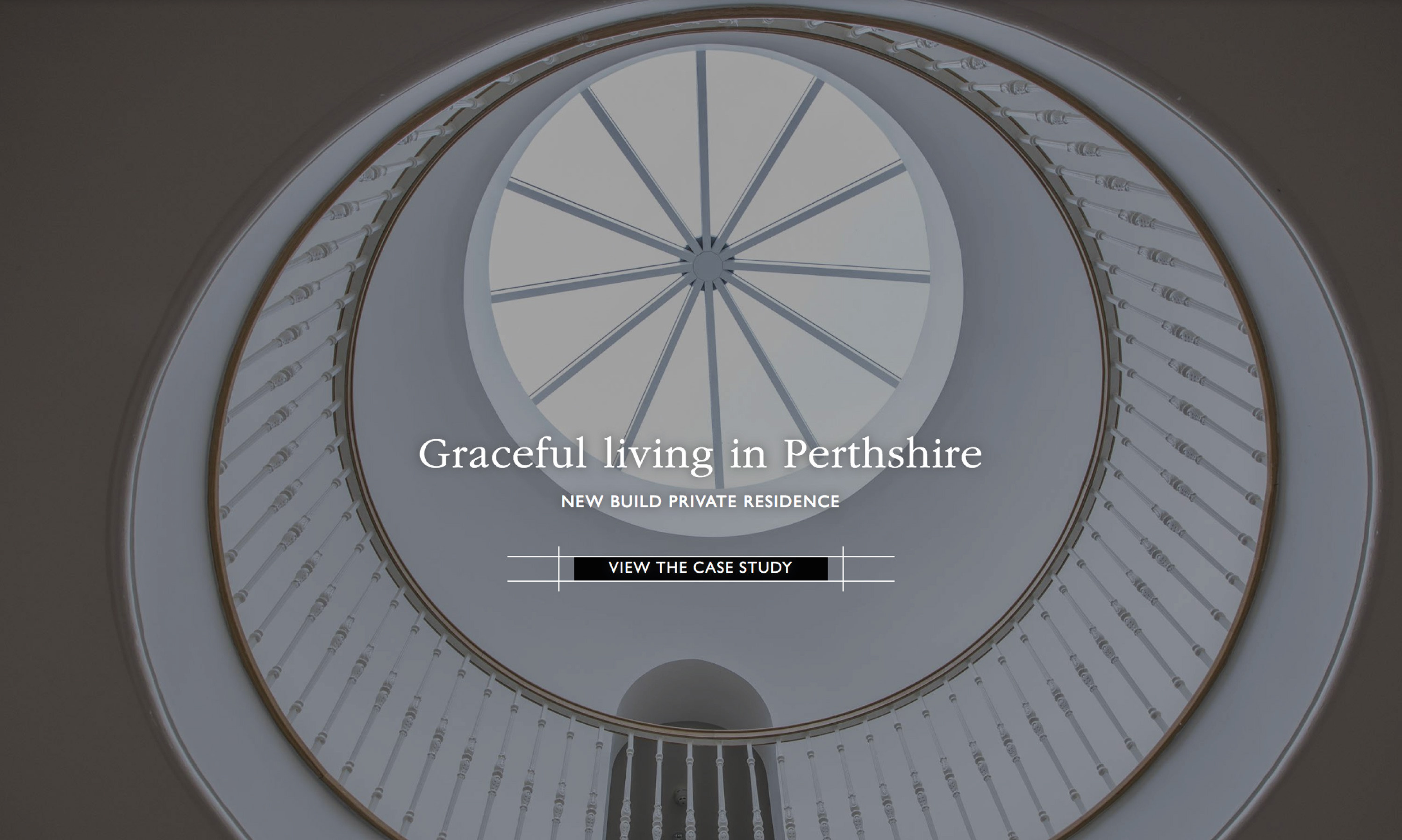
Looking carefully at the needs and resources of the business, we planned and designed a site to best showcase the content available.
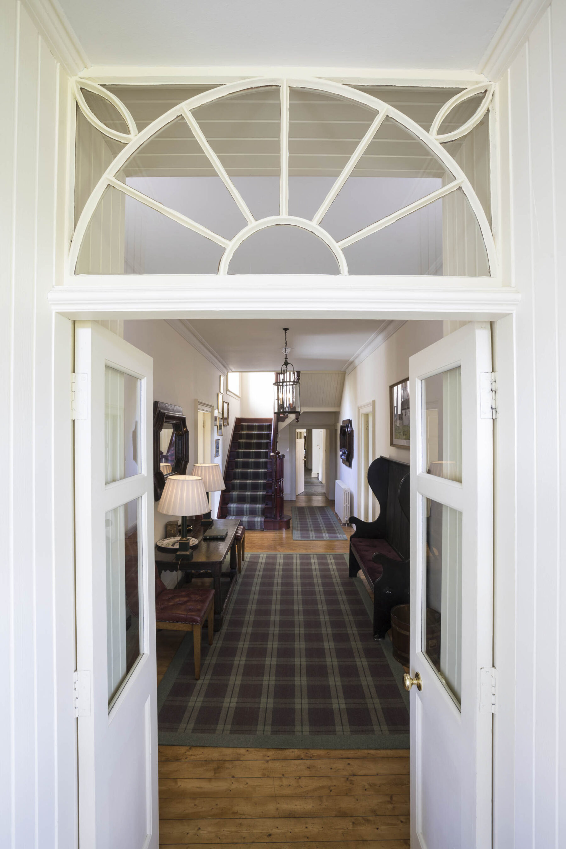
A tight selection of detailed case studies demonstrates process and expertise.
Flexible magazine-style layouts can cope with a mixture of source material, including both professional photography and mobile phone snaps taken on-site.
Visit harrytaylors.co.uk
Director, Harry Taylor & Company


The result
This well-established firm has cohesive, professional branding for the first time.
Now that it has an online presence, the practice can easily demonstrate its experience and impressive credentials to potential clients (and prospective staff), putting its best foot forward and saving time in the process.
Harry Taylor & Co no longer risks being left
behind.
Director, Harry Taylor & Company

